Satori - A VR Meditation app - UX Case Study
Introduction:
In the week beginning 11 March 2021, in the UK, ITV news reported that over 50% of front line workers were suffering from some level of PTSD (Post traumatic stress disorder). In the wake of the COVID 19 pandemic, that has run for over 1 year. With a rise in Anxiety and Stress, the purpose of this project, was to employ the immersive qualities of VR, to alleviate stress and anxiety through a meditation app. There are numerous meditation apps, on mobile, and a few on VR, my research showed, that users were often confused, and overwhelmed by them usually due to poor product design and UX considerations. The purpose of this project was to design a meditation experience that was authentic, and true to the principles of meditation. Accounting for a pleasant user experience, and a good product design.
Goals
Immediate:
To create a MVP, for user testing in VR.
Long Term:
To create a fully fledged VR meditation app, that provides the user, with an experience that truly meets their needs.
The Problem statement:
My research revealed that while there were alot of users, who were adopting mobile meditation apps. There were only a handful of “paid” apps, that users were happy with. A few of the complaints registered a three main clusters of issues:
- Too many disparate options. Meaning users found it stressful to choose. (Poor product design/UX))
- Apps that were advertised as “Free”. But then withheld any useful content behind a paywall. (Poor product design/UX/transparency/Ethics)
- In the VR space, technology was being placed ahead of user experience, or a solid product offering.
My personal take here as a long term meditator. Was that I had been unable to sustain a level of practice, that I had in the past. I’d regularly visit a monastery nearby to meditate, and participate in the community. With the COVID lockdown, I felt my practice had suffered, due to not being able to be in that physical environment. I feel it becomes easier to meditate, when one is in an environment that is build to be conducive to that purpose. Monasteries are built to bring you to a place of calm, even before you sit on a cushion/chair, to begin meditating. I hoped to create that experience with the use of VR for others. As this was one point that has helped me maintain a practice for over 12 years.
Users:
Users identified during research, tended to me a mix of men and women, women being the majority. Mostly white collar professionals. Who were looking for some sort of a wellbeing experience to cope with anxiety and stress.
My Role:
- User Research
- Product Design
- Interaction design
- 3D design
- VR prototyping
Scope and constraints:
As this has started out as a personal project, I was limited as to the level of detail I could create in the prototype. Also, meditation apps in the VR space are pretty limited. Most are designed as "landscape" experiences, where the user is placed, in a 3D environment, with engaging scenery. It seems meditation takes a back seat. So designing something within the constraints, of what can be done in VR was vital. These relate to the amount of time a user can spend safely in VR. And also designing to be mindful of issues such as vertigo, sickness and headaches.
Competitive Analysis
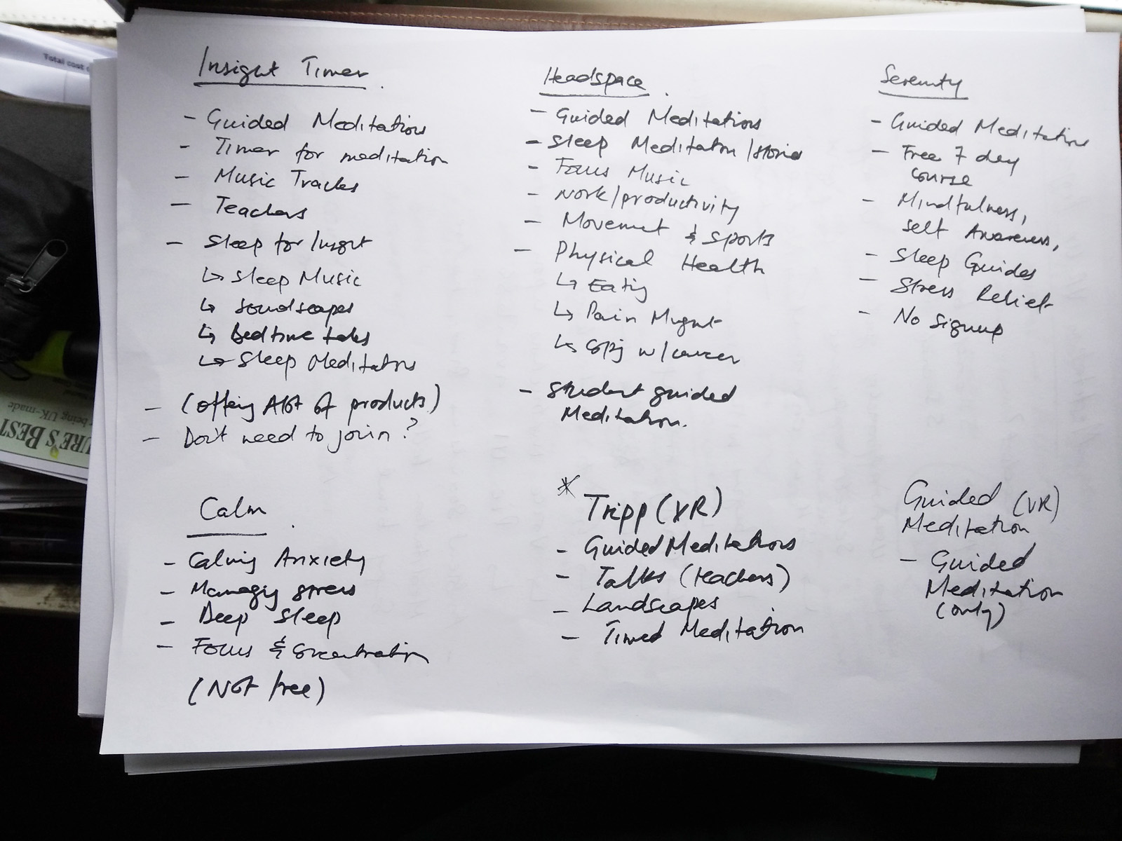
There were around 4 apps on the oculus store, and I sampled 4 of the largest apps, on the Android store. The apps on the oculus store had around 3 main categories, guided meditations, VR landscapes, teacher talks. The apps on the Android store seemed cluttered with a huge array of different topics.. Once again the main topics were the above. But it seemed like each player was trying to differentiate their offering by adding niche categories like “student guided meditations”, “food meditation”. One thing my research had revealed was that users felt somewhat overwhelmed by the sheer number of product propositions offered by some players on the Android app store.

User Research
A set of quick insights revealed by the mix of informal interviews, a survey and desk research, revealed:
- Most users identified as female
- Mostly under 65 (This might hint at technological competence)
- With just over 30% maintaining a daily practice. The remainder seemed "casual" meditators.
- Only 2% of respondents had tried VR for meditation (This is new tech, and this insight was in line with expecations)
- As VR is a new technology, we may also assume, that early adopters are probably male, and as more meditators from my findings tended to identify as female. I'd find less of an instance of females using VR for meditation.
Demographics

Insights into users future outlook on the Pandemic
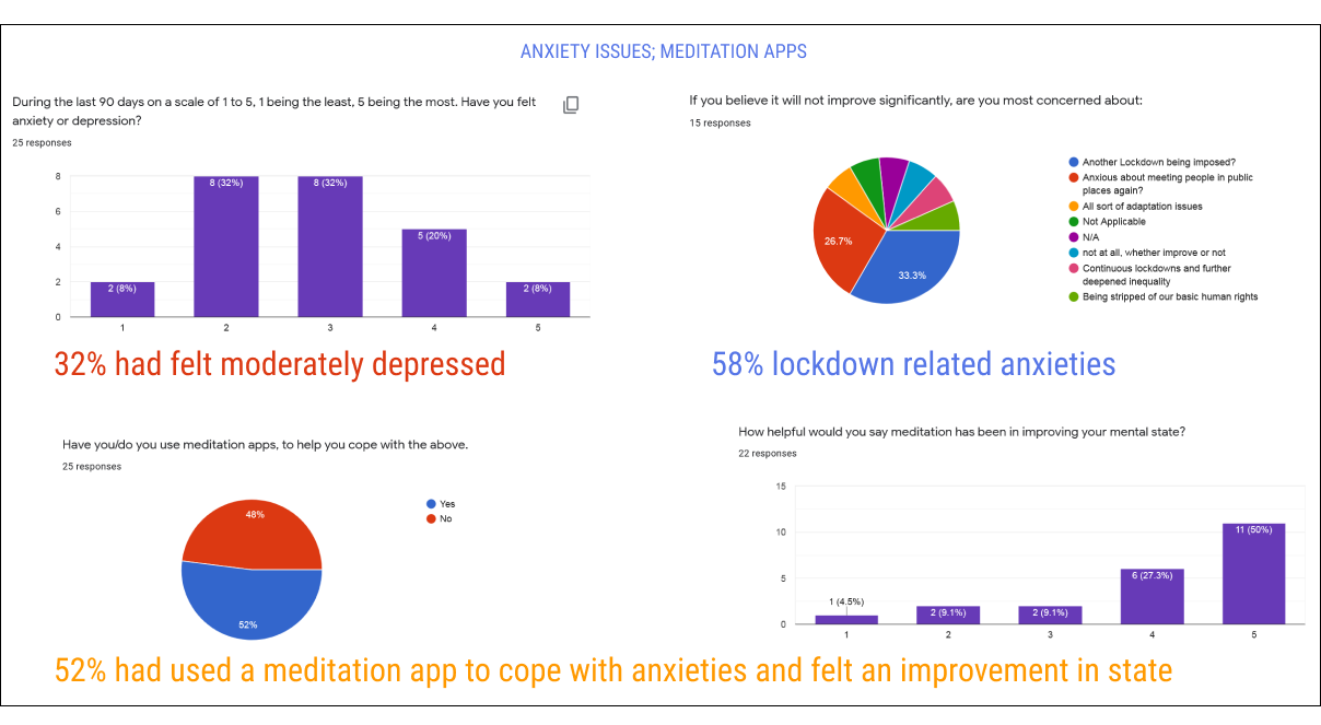
Most people were optimistic that things would improve in the next few months (context of the pandemic/lockdown). 32% had at some point felt moderately depressed/anxious. 28% had felt quite depressed/anxious. Over half had used a meditation app, to cope. In interviews it turned out, that more experienced meditators shunned the apps. They saw apps, as something that would cause them to become “dependent” on technology. Taking away from the true meaning of a meditation practice. This would imply that most responders were beginner meditators. Looking for a coping mechanism. And perhaps build a practice.
The apps used, how users chose, what they disliked
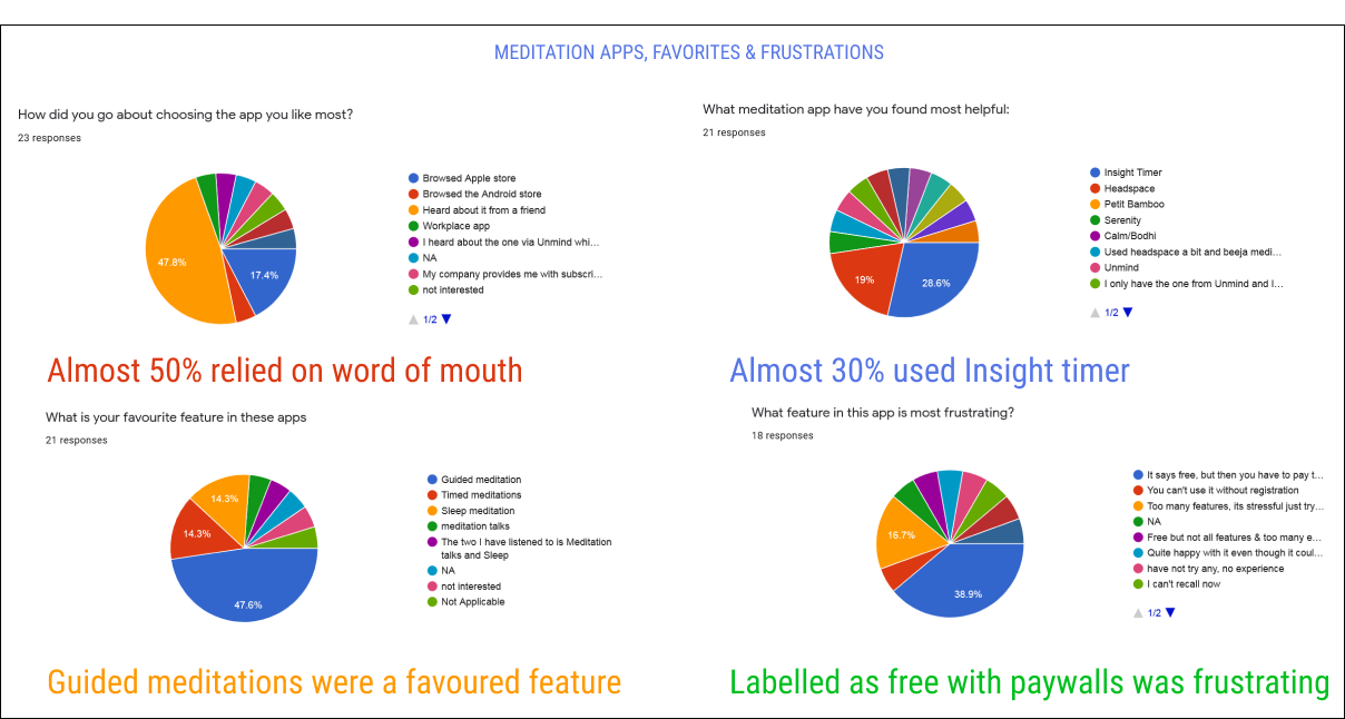
Most users had relied on word of mouth to choose an app. Insight timer seemed to be a favourite. Guided meditations were a favourite feature. And apps labelled as free, keeping any useful content behind a paywall were a major frustration (A lack of transparency). Too many features also seemed frustrating. The competitive analysis lists all features and some have numerous.
Affinity Map: User Expectations from an app
There was a fair bit of variety, in expectations. Some themes were “guided meditation”, “simple/userfriendly”, “Calming”. Something not often found in the offerings currently on the market. Themes coming up in the user benefit affinity maps were: “calm”, “stress reduction”, “wellbeing”. Seems the apps delivered on this aspect. These insights revealed that the apps did deliver benefits. But poor UX and product features hindered this to some extent.When asked about how these apps could be improved users cited factors previously mentioned: Transparency, a clearer less cluttered product offering, and a few technical aspects like sleep meditation app features.


Improvement suggestions from survey

User Personas
I created 3 user personas based on what my research had revealed about the users.

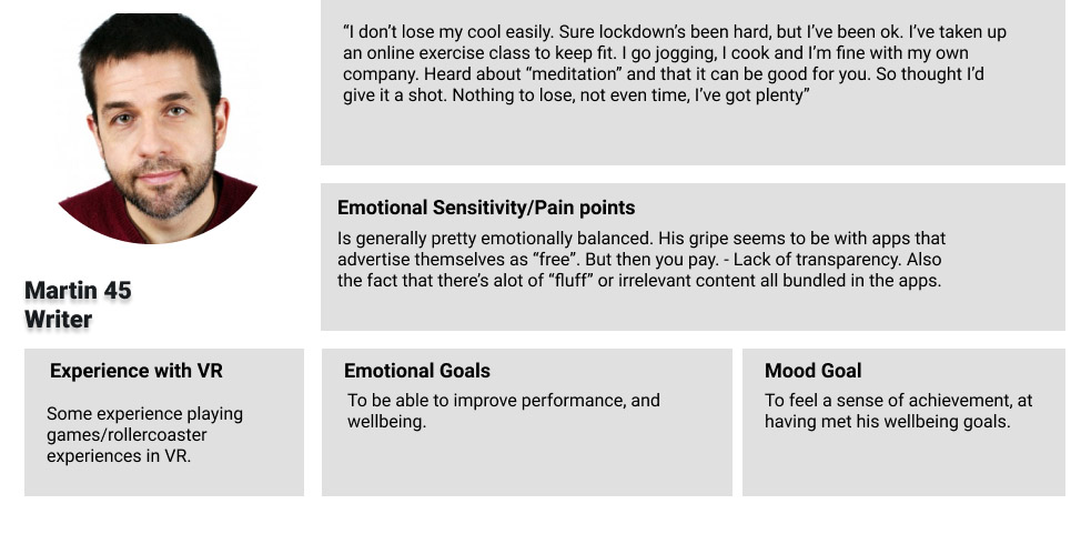
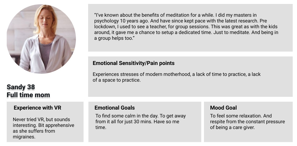
User Journey Maps:
Using a combination of the personas and user research I mapped out the user journeys. This revealed points in the user journey where people held anxieties, and opportunities where they could be addressed within the buying cycle:
There were concerns around making the right choice of app centered around trust, clarity and product value. App visibility on the platforms. Clearly setting out where an app is free or where a subscription is required. Reassuring users that the app would not cause motion sickness or headaches, which is an issue with VR.
User journey map: Katerina 32 - Business Analyst:

User journey map: Martin 45 - Writer:

User journey map: Sandy 38 - Full time mum:

VR Wireframes in 2d:
Using a common template for VR wireframing I mapped out the interaction/storyboard in 2d, prior to creating the experience in 3D. I used all the insights from the research above, combined with VR best practices to create the below: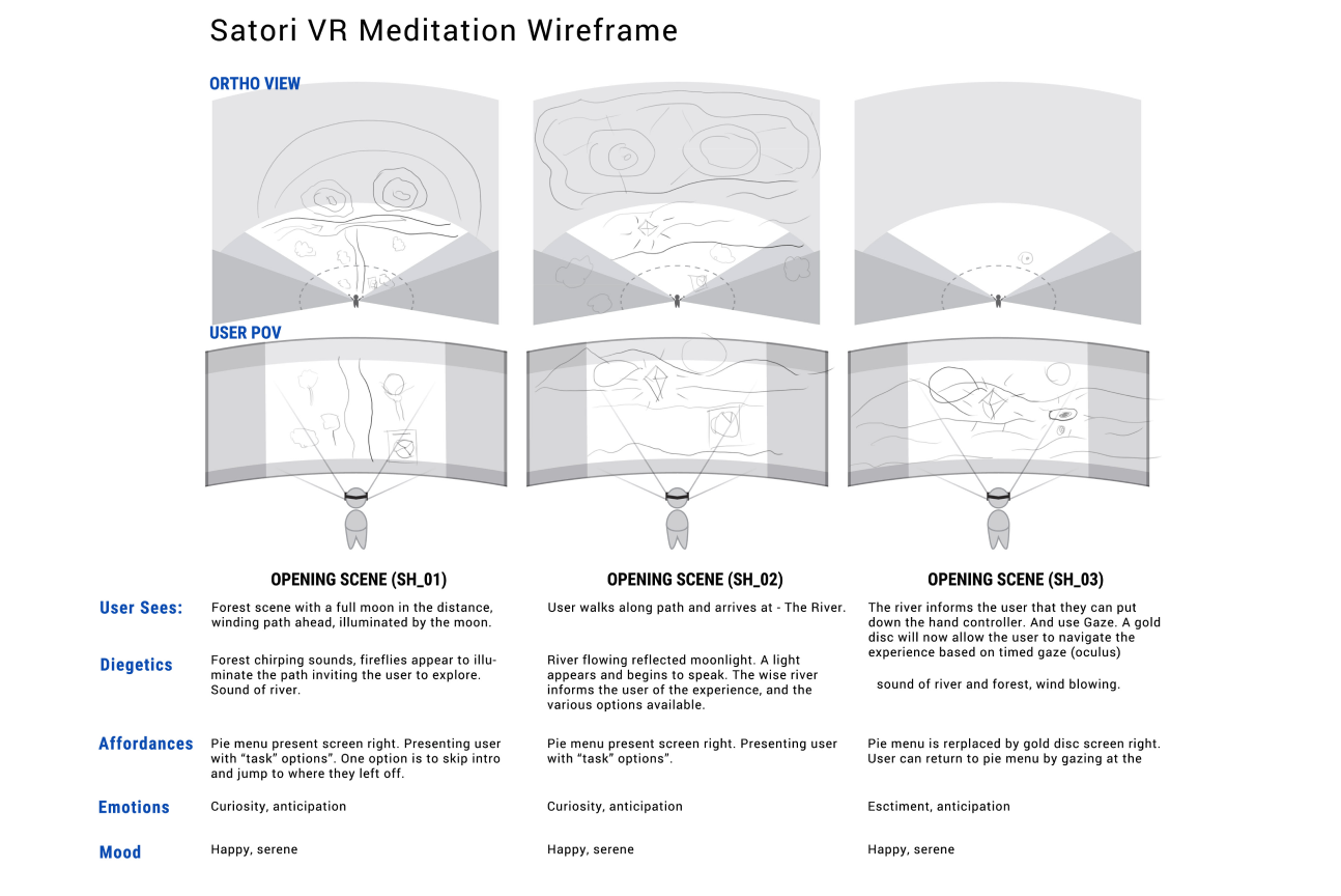

User Flow
In keeping with what the research had revealed, users were looking for an uncluttered simple to navigate experience, based on that I developed this user flow:

Prototyping and concept development
The Initial Prototype was created in unity to run on the Oculus Quest 2, the high res concepts in Blender. To watch a demo of the prototype click here: VR Prototype in UnityLearning and Insights
The research process revealed what has been reiterated many times when it comes to experiences related to technology. The technology should support the user experience. VR being a new technology, means developers wish to highlight the newest features, this sometimes detracts away from the essential benefits that the app set out to deliver. Simplicity in design probably yields better results than something convoluted. From developing the concept, I also learned the importance of tailoring the concept to the constraints of the hardware one works with. The Quest 2 currently only supports relatively simple graphics, nothing near a cinematic level of visual quality. So any concepts must be tempered to match that.
